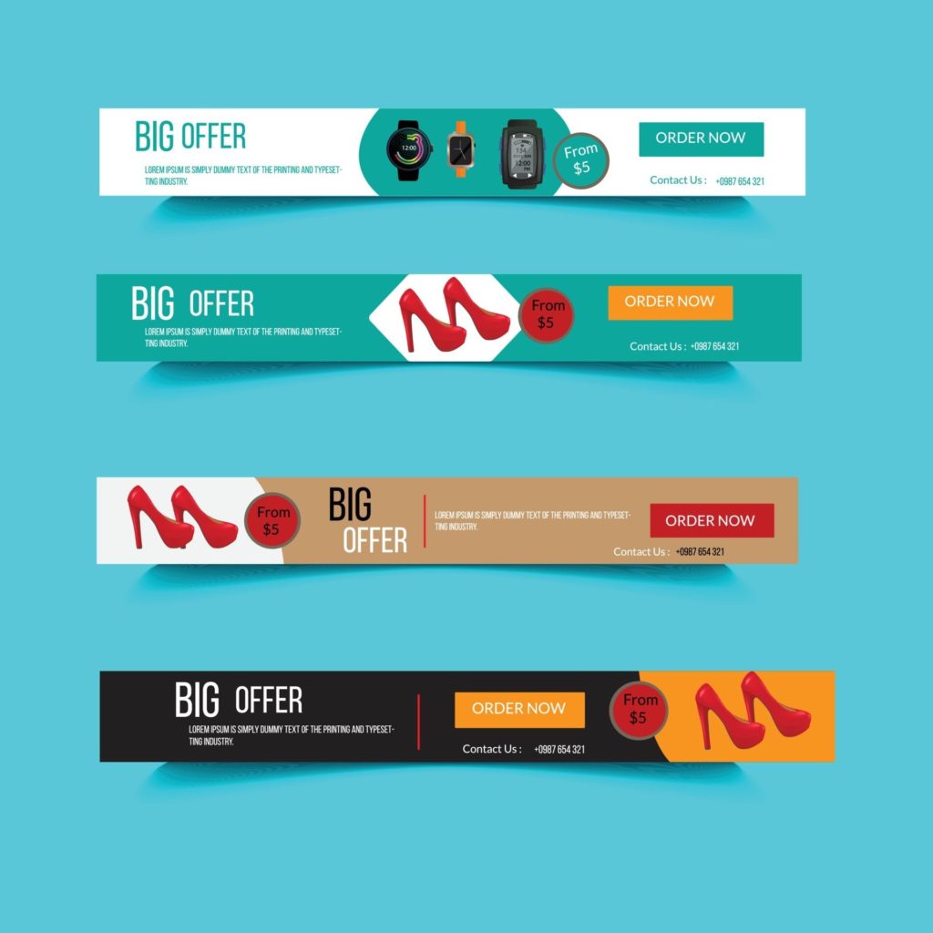
An online business is the best solution to the world we live in currently. However, all business needs to be promoted and web banner ads are a greatly effective way to do this online.
Banner advertisements put a business in front of people who don’t know about it. Clicking on your banner ad takes them to a landing page on your site, where you give an offer to them.
Therefore, here we will tell you the basics of web banner design so you will be able to create your own banner.
What is a banner ad?
Typically, a banner ad makes an offer to get people to click for more information. Every banner has a call-to-action or CTA button. So think of big, bold, and clear messages printed on them.
- “Hurry!”
- “Festival Sale!”
- “Subscribe Now!”
- “Limited Time Offer!”

Standard sizes of banner
Every big website such as Amazon, Google, Linked In, and Facebook has its own banner sizes. But these are the styles you should choose from:
- Leaderboard: Displayed at the bottom or top of a webpage.
- Skyscraper: Large spaces, accommodated on the left or right sides of a webpage.
- Wide skyscraper: Rectangular and tall. Skyscrapers and wide skyscrapers both are very hard to miss.
- Half page: Huge space with ample elbow room for more visuals and graphics, if necessary.
- Medium rectangle: Medium-sized rectangular.
- Large rectangle: Larger than medium-sized rectangular.
- Mobile leaderboard: Relevant for mobile interfaces.
Every year, banner size standards are updated and it is best to design according to the standards. Selecting a different size can mean increased costs and wasted effort.
Ready to create web banner design?
An effective web banner design draws attention within the first seconds. Following are seven steps to follow when creating a banner ad design.
Use a visually rich image
Calibrated and scientific studies have proved that our ability of processing images is about 60,000 faster than text. However, a general image may hardly garner interest. Choose or create images that entice a potential client to stop and read the text.
Keep in mind that a banner image is the first impression you give to viewers. The more creative and interesting it is, the more clicks your ad will gain.
Static or animated?
A static web banner design has a still image, along with text in PNG, JPEG, or GIF format. They are non-interactive and capture less attention.
On the other hand, animated banners are interactive and they generate great curiosity.
Pick your colors carefully
Color is the most effective tool of non-verbal communication. It triggers powerful emotions and has a direct impact on likeability. For this reason, color is a significant choice in your web banner design.
The reason for whether your product will be purchased or not may lie well behind something as humble as color. The strong subconscious influences conversions.
Men and women show differences in preference of color palettes. So, it is a great idea to study the latest color choices before a web banner, if your product is gender-specific.
Keep your call-to-action short
After attracting attention to itself, the banner ad has to send the viewer to your website. This is accomplished by a CTA on the web banner.
Tell them what to do next – “Get your free sample”, “Browse more colors” etc.
Banners with CTA, reach 200% more than banners without CTA. If you want to drive leads, include a visible CTA with simple action-oriented text that will incite the reader to click and proceed to your site.

Keep a tight focus
Keep the banner concise, precise, and focused. Avoid mess and drive a single, fascinating message that tempts the visitor into visiting your site.
Vague messages will just result in inaction and the banner’s purpose will be completely lost.
A typical banner includes:
- Logo
- Image
- Line of text
- Call-to-action button.
The simpler you will keep it, the lesser the distraction will be.
Text
Ensure the texts are different and set in various types of sizes. The copy must be short and limited to four lines. Don’t use more than two types of font. Refrain from fonts in cursive writing.
Use urgency for your benefit
The purpose of a web banner ad is to communicate urgency, both in text and visually. The way to accomplish this vision is to apply bold and contrasting colors.
Putting a deadline on your offer will make people click more for fear of losing out.
The text should be carefully thought out, appropriate, and have the right impact on the users.
Let the web banner designing begin!
A banner ad will help your business grow rapidly. To recap, the following are the basics of a great website banner design.
Read More: Kotak Mahindra bank credit card tracking
- Incorporate a clean, crisp, compelling message and powerful, evocative imagery.
- Include a sense of urgency and excitement.
- Stand different to be noticed.
A well-thought-out web banner design is the gateway to success in this online world.


